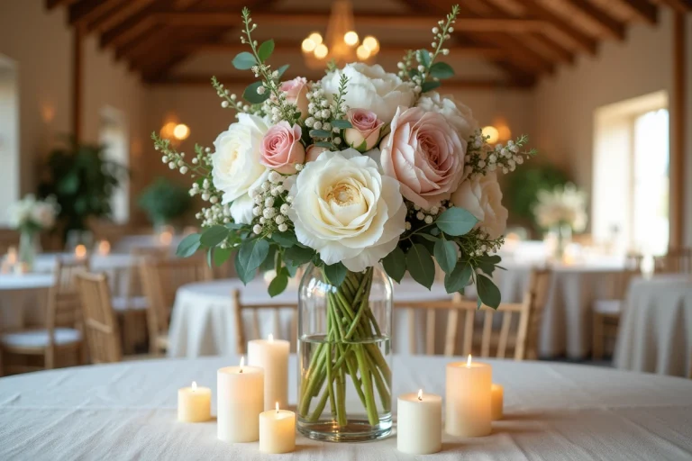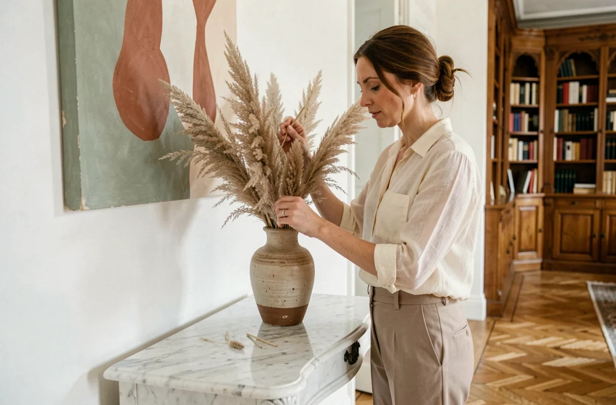
A personalized interior decoration relies on choices of materials, colors, and furniture that reflect a specific lifestyle. Far from generic catalogs, the coherence of an interior is built through the articulation of a few structuring decisions: the color palette, the hierarchy of materials, and the provenance of the pieces that make up each space.
Color Palette and Interior Decoration: Setting the Foundation Before Any Purchase
The choice of colors determines the overall perception of a room. Working with a limited palette, a maximum of three shades, avoids visual overload and facilitates the gradual integration of new elements.
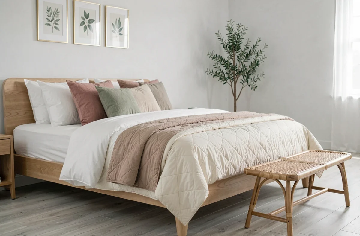
Earth tones (beige, mocha, terracotta) dominate recent interior decoration projects. These warm shades work well on an accent wall as well as on textiles, and they naturally pair with wood, linen, or stone.
A common pitfall: choosing colors on screen without testing a physical sample. The natural light in a room significantly alters the appearance of a shade. A warm beige can turn gray in a north-facing space. Before finalizing a color, applying a test patch directly on the concerned wall remains the most reliable method.
Specialized catalogs like those available at maisonartdeco.fr allow you to visualize color and material combinations in real interiors, which helps refine your choices before diving in.
Matching Wall Color with Existing Furniture
If the furniture is already in place, the wall color must adapt to it, not the other way around. A light gray fabric sofa gains presence against a terracotta wall. A dark walnut piece of furniture fades against a wall that is too dark.
The color of the main wall directs the entire perception of the space. Starting from the largest piece of furniture in the room to determine the dominant shade avoids mismatches.
Materials and Textures: Creating Relief in a Personalized Interior
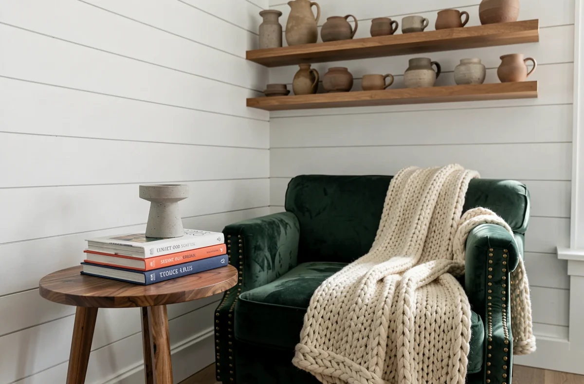
The layering of materials adds depth to a decor, even if monochrome. The principle is based on tactile contrast: pairing a smooth surface (glass, polished metal, lacquer) with a rough or organic surface (raw wood, crumpled linen, handmade ceramics).
An interior made of a single material appears flat, regardless of the color. A solid oak tabletop resting on black metal legs creates a visual dialogue that two identical materials would not produce.
Hierarchy of Materials by Room
Each room has specific constraints that guide the choice of materials:
- The living room tolerates fragile materials (velvet, marble, blown glass) because it undergoes less mechanical wear than a kitchen or entryway.
- The kitchen and bathroom require surfaces resistant to moisture and easy to clean, which limits options but does not exclude treated wood or waxed concrete.
- The bedroom favors soft and absorbent textures (linen, wool, thick cotton) that dampen noise and enhance the feeling of comfort.
Considering these constraints before choosing a decorative style avoids disappointments in use. An untreated white marble countertop in a kitchen, no matter how elegant, stains irreversibly within a few months.
Second-Hand Furniture and Reuse: A Concrete Lever for Personalization
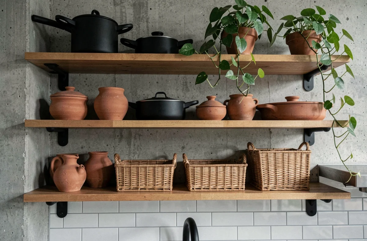
Incorporating antique or second-hand furniture into a modern interior is one of the most effective ways to stand out. A 1960s sideboard or a distressed farmhouse table brings a uniqueness that no new furniture catalog can replicate.
The reuse of furniture has taken on an additional dimension since the sector has organized itself. In 2025, Ecomaison supported 155 projects and 740 structures in the social and solidarity economy to steer more products towards a second life rather than recycling. This infrastructure makes it easier to purchase unique pieces at reasonable prices.
Combining Old and Contemporary Without a Taste Faux Pas
The simplest rule: limit antique pieces to one or two strong elements per room. A vintage club chair in a contemporary design living room creates a focal point. Five pieces of furniture from different eras in the same space produce an uncontrolled flea market effect.
Antique furniture works as an accent, not as a base. The rest of the decor benefits from remaining understated so that the vintage piece retains its visual impact.
Air Quality and Choice of Decorative Materials
An aspect rarely addressed in decoration guides concerns the impact of materials on indoor air. According to Qualitel, quality ventilation combined with health-friendly materials significantly improves indoor air quality.
Paints, glues, varnishes, and certain textiles emit volatile organic compounds for weeks after installation. Choosing low-emission materials protects air quality as much as the aesthetics of the space.
Since December 15, 2022, the Triman signage applies to furniture, and since August 25, 2023, to textile decorative elements. This marking indicates a clear sorting instruction and points to products designed to be repairable or disassemblable. Checking for this logo at the time of purchase allows for a personalized style to be reconciled with a more sustainable approach.
- Prioritize paints labeled low in VOCs for walls and woodwork.
- Check the certifications of wood panels (plywood, MDF) used in furniture.
- Ventilate thoroughly after each intervention (painting, flooring installation, new furniture setup) for several days.
The decoration of an elegant interior relies less on a high budget than on the coherence of choices. A well-mastered color palette, two or three well-contrasted materials, a unique piece of furniture, and healthy materials are enough to transform a generic space into a place that carries an identity.